Connect with:

Standard Blog Whole Post

If there is one thing that the ‘universe of style’ demands is a certain consistency, writes Robin Dutt. The Italian house, Etro has represented a very unique consistency within change for over four decades as its elegant and luxe men’s collections is everything to go by.

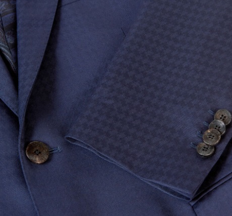
Most admirers and wearing-enthusiasts of the label’s hallmarks know how it is unafraid to use bold colour or clashing hues and  optic pattern. The designers keep things simple – pure tailored elegance which reassures because of the line but more than allows for the individual stamp of the man sporting it.

Cheerfully breaking rules, such as ‘Blue and green should never be seen’ or ‘Never brown in town’  Etro exercises its right to be flagrantly bold and yet remarkably wearable – even when dicing with the most vivid colours and graphic patterns. The tailoring contains but does not restrain the leaping prints and weaves.

The house has famously returned, always to the paisley motif in all it does from outerwear to lining, shirting to leatherwear, accessories to swimwear. Actually, one might as well say…everything. The motif, has transcended fashion – even though it is on trend, continually.

It says much about this ancient shape and symbol’s international magnetism. Fluidly represented throughout history and from its earliest days, paisley has captivated the imagination of designers across the board, whether those creating garments or others suggesting interior schemes.

Historically and traditionally, paisley may be thought of as more ‘rhythmic’ and ‘logical’ Expect this at the house of Etro but also winning new ways with dealing with an old favourite. The important point is that several paisley shapes together represent a dance and a continuum. The familiar teardrop shape is called ‘botch’, of Persian origin but with strong Indian links too. And whoever opined that ‘East is East and West is West’ was wrong – when it comes to paisley. The design has been embraced by both – not to mention the North and South, too.

Paisley’s name originates from the Scottish town of Paisley where the curvaceous designs were also produced. The simple shape of the paisley ‘leaf’ with its often attendant designs makes for a winning playground of colour and light possibilities and even, say a black paisley motif on a black ground looks effortlessly chic and assured – an example like this, perfect for an evening opera scarf, say.

But Etro continually investigates new patterns, influences and of course colour combinations. This season (along with the ever present paisleys) consider the glossy, lush, prowling tiger and water lily prints – a nod to painter Rousseau, perhaps, or carpet patterns on jacquard weave – present also in the company’s Home collection where you can collapse into capacious, printed cushions and be camouflaged wearing the same printed suit!

But whilst tradition may be important, Etro is also continuing with its commitment to eco-friendly fabrics for its creations and interestingly, showcases this year,unique pieces which feature patchwork denim trousers and jackets which include vintage cloths. Shirts are made from eucalyptus yarn and polo shirts made from plastic bottles in a bid to help the planet. The result? Still luxurious.

The logo of Casa Etro is as distinctive as it is subtle and even those who naturally eschew an easily recognisable label – because who wants to be an unpaid advertiser? – actually seek it out and love to wear it openly. It is an image of a leaping Pegasus silhouette, encapsulating the freedom and energy of the company. Pegasus, a creature of mythology symbolizes spiritual freedom – and the possibility of the impossible.

The winged horse may be the stuff of imagination but Etro has made its company fame – and fortune, real enough.

If there is one thing that the

With possibly one of the most iconic band names in rock history, The Who typified the spirit of a generation, writes Robin Dutt.

With their instantly recognisable motifs – the Union Jack, “bull’s eye” patriotic target (and Mod emblem) and of course, that cheeky and suggestive arrow emerging from the ‘O’ in ‘Who’, the group epitomised a very English, very electric rock ‘n’ roll wizardry – Pinball or otherwise.

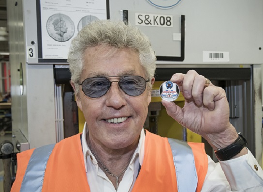
The Royal Mint has launched a new collectible coin range to honour the British rockers and lead singer, Roger Daltrey visited the Mint’s HQ to strike one of the first examples.

“It is an honour to have a coin produced to celebrate The Who’s musical legacy,” he said. “The coins’ design captures the true essence of the band and what we represent.”

And lead guitarist, Pete Townshend is said to be delighted with the range of coins, calling it “fantastic”. Of course, what the band represented was that unique English rebellion in rock with swirling performances, edgy stage costumes and that emphasis on being loud – shatteringly so – from the destruction of musical equipment to the near ear-bleeding level of overall volume and strategic, rebellious cacophony laced through structured harmony.

Such destructive theatricals were nothing new. Many groups seemed to use an anarchic and rebellious approach – John’s Children smashing up stages, Jimi Hendrix burning his guitar, Marc Bolan, classically camp (and gloriously so) whipping his and the Sex Pistols typifying visual anarchy. But one might say that The Who’s was a most original contribution.

John Entwistle, Pete Townshend and Roger Daltrey were the shock-rock originals only to be joined later by that glorious one-off in his own right: drummer, Keith Moon and the band has a musical credential spanning well over half a century with 100 million albums sold worldwide and more than a billion global streams.

The coins feature images from the band’s live performances – a Union flag, Mod logo and legendary speaker-smashing Rickenbacker guitar (no wonder many refer to this instrument as an ‘axe’) and together, the icons form a pinball table, inspired by the 1969 single, ‘Pinball Wizard’ and the iconic album, ‘Tommy’ – one of the most audaciously original compilations of songs with a brilliant, unforgettable film too which mixed fantasy, surrealism and hard rock, starring amongst others Tina Turner and Elton John.

A number of newly-struck coins will feature a special “shockwave” effect radiating from the speaker.

I’ve often wondered whether there might have been more efficacy and suggestion had the band considered using a question mark after the name The Who as a cheeky suggestion. Given the group’s legacy, however, it would have been totally unnecessary.

The cost?

The Who 2021 UK Half Ounce Silver Proof Coin RRP £65 (Mintage – 10,010)

The Who 2021 UK Gold Proof Coin RRP £68,380 (Mintage – 12)

With possibly one of the most iconic

L’Wren Scott was a unique and unusual talent, says Robin Dutt. A statuesque beauty, she was a couturier and stylist whose remarkable pieces graced the forms of, among others, Nicole Kid-man, Penelope Cruz, Renee Zellweger and Sarah Jessica Parker.

Perhaps her most memorable outfit was the embroidered kimono tailcoat from the ‘Tagasode’ Collection which one might say clearly referenced the lines of male sartoria with perchance, a nod to Alexander McQueen at his most Oriental exotic. It is all too evident how both late creators admired the strident line of the best suiting.

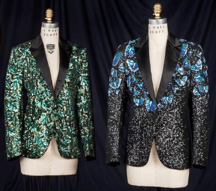
Scott was the one-time partner of Mick Jagger before her untimely passing, seven years ago and included in the sale are two bespoke jackets designed especially for him – one clipped the ‘glamouflage’ (pictured) made of black satin, beaded and spangled intensely with sequins and embroidered with English oak leaf motifs, carrying an estimate of £20,000-£30,000.

This is also the estimate for the somewhat ceremonial butterfly jacket where the images of those insects are rendered in petrol and teal blue like those native to South America and again on a field of glinting sequins.

The way the motifs have been applied has something of the official and certainly mayoral about it. Jagger wore this showstopper whilst performing ‘Miss You’ when large screens surrounding the Hyde Park stage showed blue butterflies fluttering to the sky as a tribute to the doomed Bri-an Jones, and recalling the band’s 1969 Hyde Park concert, when white butterflies were re-leased in his honour.

Shall we say…a very different intent to one contemporary artist’s ‘immortalizing’ the creatures on canvas?

Nicole Kidman has said that L’Wren Scott ‘was exceptionally chic and refined’ and Penelope Cruz who met her when she was a stylist recalls her as ‘an incredible talent’.

A total of 55 lots will be offered at the Christie’s (London) auction and proceeds from the sale will be donated to the L’Wren Scott MA Fashion Scholarship at central Saint Martins UAL – a scholarship set up by Mick Jagger in 2015.

Under the Hammer – L’Wren’s couture and bespoke in the Christie’s auction June 9 July 1.

L’Wren Scott was a unique and unusual

‘Rus in Urbe’. It is the city ideal, writes Robin Dutt. It’s that little suggestion of the lure of the countryside in the hustle of the town. Too much, however and it’s just wrong and out of place.
Of course, some might take things to extremes and pronounce that even the colour brown (in any shade) should only be set against a backdrop of trees and grass and not steel and glass.
And Marie Antoinette had a somewhat particular, yet misinformed, idea of the glories of country life for her little town palace – sheep attached to silken ribbon-leads. It was the country idyll gone mad.
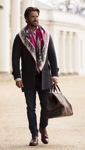
But if it is a touch of the great outdoors to team with your city slicker look, seek out the colourful flourishes of one Clare Haggas whose longer and wider-than-average printed pieces soften strident suiting edges with a touch of the ‘romantique’, lending an air of exotic fluidity and more than a dash of colour.
Haggas is an international award-winning sporting artist whose paintings grace many a country house wall or shoot room. These works of art on canvas are the direct inspiration for her scarf designs featuring hares, pheasants and other favourite country birds, leaping fish and statuesque horses.
A comparatively young company; Haggas began in 2017 when she found a fine silk manufacturer in Worcestershire. She is involved in each stage of making and is, as she says, ‘involved in every touch point’.
Silk and silk/wool mixes are ideal for every season and silk alone in particular is good, being warm in winter and cool in the summer months as this age-old material is a natural thermal regulator.
And a silk twill will hold a shape, no matter what that might be, given the wearer’s desire – whether fashioned into a soft jabot or dashingly tied as an example of studied negligence.
The vibrancy of Haggas’ chosen palette – warm russets, gleaming golds, teal or dark blues and dramatic black make for fine, handcrafted statements of sartorial intent – to be scrunched away by the neckline of a shirt or on parade as a flowing painting around the shoulders.
Each product, from a pochette (£35) to a large scarf (£195) is presented in a bespoke box with a hand-written note from the creator. As she says, “The vibrancy of my original artwork is really important to me … each piece I create is like a snapshot in time. Because there is so much movement in the wildlife I study, I want to have that second captured in my work.”
But it’s not all about the importance of sericulture aesthetics. Possibly simply because of them.
From September 2020 to January 2021, her accessories experienced a 300 per cent year-on-year increase in sales of its core scarf range and a 100 per cent jump in web traffic for the same period. It is proof positive that such often ignored details like an expertly rolled edge or the use of that particularly vibrant hue makes all the difference to the scarf aficionado.
Scarves like these become timeless components in any wardrobe and more and more men are finding ways to enjoy wearing them as integral stylistic devices – be it a simple white-piece or a more flamboyant expression of intent.
More on those here  
07943 502 2756
London stockist – Cordings of Piccadilly.

'Rus in Urbe'. It is the city ideal,

Book Review – ‘Palaces of Pleasure’ – Lee Jackson 

By Robin Dutt 

It has been a year of deprivation of many things. And it has to be stressed that, although we might be emerging into the light, we are not there yet. Sociability, shopping, conversation, imbibing and, basically, all aspects of what we knew as normal behaviour pre-Covid have been and will be effected for a time to come.

And it’s a sure bet that if one were able to crystalise exactly what we all were missing in one word, that word would be pleasure. At first, a full Lockdown, then variations of the same by way of a partial one, we all know what it is to be starved of pleasure to such an extent that this goes way beyond the actual pleasure of pleasure itself!

A dearth of fun and joy breeds depression, lethargy, introspection, negative thoughts, boredom – and much worse. Artificial diversions are simply that. Nothing can take the place of the real thing.

So, Lee Jackson’s latest book on the subject is one we can enjoy for its rich detail and its focus on what pleasure meant to our species in specific environs two centuries ago and of course how this has changed – if it has, in essence, at least. Venues may come and go but that human expectation to enjoy life is still the same – increased though in our age, by so much choice of venue and experience.  But this throws the effect of the pandemic into sharper focus. Take away our pleasure, our enjoyment and we become less – in every way.

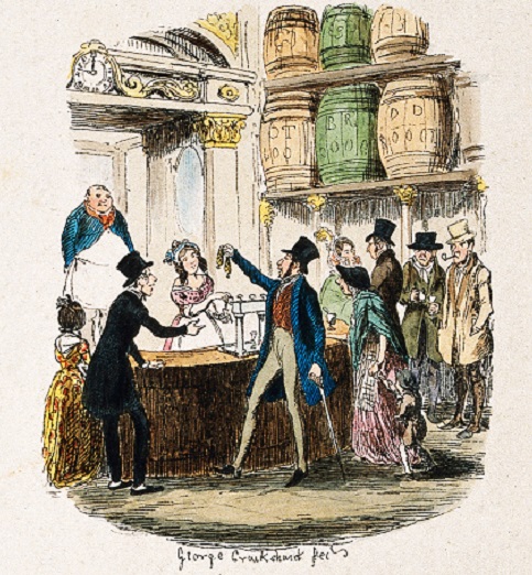
Palaces of Pleasure highlights everything from the Gin Palace to the Music Hall, the Dancing Room to the Pleasure Garden, the Exhibition Room to the Seaside. For our twenty-first century, read pubs, theatres, nightclubs, parks and galleries. But then, as now, the seaside is a huge British tourist draw and one so many of us missed in this last year, unless you happen to live by it. And how we took our scepter’d isle with its countless resorts for granted.

All of these diversions are essential to the well-being of the human psyche and how we came to value that taken for granted coffee in a cafe with a friend as opposed to having to book a time slotted table and sit socially distanced and don the mask when you needed the loo. And what of sport?

As a football-loving nation, we were all quickly reminded that it is not simply watching two teams battle it out. The ‘society of the stands’ is crucial and that feeling of ‘being there’.

Jackson’s book could not have been better timed, for we are still in the grip (though lessening) of the Covid crisis but with a less than sure vista regarding certain beloved pleasure palaces of our own, perhaps never to open again and which we all thought would be there forever. By the end of all of this, everyone will have lost a favourite establishment.  Will we ever take pleasure for granted again? Knowing what we are as a species, we forget – and adapt.

But one thing is for certain, pointed out by D.J.Taylor, writing in the Wall Street Journal – ‘pleasure is, at bottom, a deeply serious business’.

Palaces of Pleasure’ by Lee Jackson is published by Yale University Press. £10.99 

Image shows: A busy gin palace bar with customers buying drinks. Coloured etching by G. Cruikshank, c. 1842. Wellcome Collection


Book Review - 'Palaces of Pleasure' -