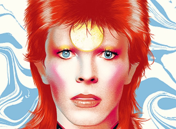
It has been five years (there’s a Bowie song there, somewhere) since this grandmaster of musical and performance creativity died and about 50 years since he stole the show with the lilting and strategically seductive, ‘Starman’, writes Robin Dutt.
So many people (d’un age certain) will remember this moment with fixed fascination and awe, when he burst through the TV screens – for most in black and white (but there seemed to be colour) and sung – ‘I had to ‘phone someone, so I picked on you – oo, oo’.
And accompanied by that camera-pointing index finger, almost fencing foil targeting, everyone surely thought, he was speaking about them and them alone whilst at the same time, knowing or at least, hoping that there were others out there who felt exactly the same. Ian McCulloch of Echo & the Bunnymen saw Bowie’s performance as a 12-year old and recalled ‘The presence of it.’ Gary Kemp of Spandau Ballet calls it ‘my seminal moment’.
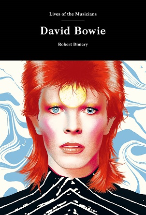
Robert Dimery’s livre de poche entitled simply, ‘David Bowie’ in a series of ‘Lives of the Musicians’ reminds in cogent detail, Bowie’s extraordinary originality and versatility. The star knew that to stay the same was to atrophy and so, ‘Ch-ch-ch Changes’ were the way forward and the only way to establish longevity.
Although we may know much of the detail of Bowie’s life (or lives) Dimery’s is a welcome and not obtrusive presence throughout, as a guide
”Look out all you rock and rollers’ is one of the lines in that song which is surely a somewhat cheeky warning. Perhaps, it is even self- referencing too. And yet, when other ‘stars’ reinvent themselves, it is usually done mechanically and as a result of the force of fashion. He might have been a chameleon but he was reacting not to prevailing trend but his personal environ.
Bowie was able to counter the moment and the circumstance. Dimery reminds also just what a great wearer of tailoring Bowie was – of course unconventional and sporting the sharp and sculpted cuts of such visionaries as Thierry Mugler and Kansai.
The photographs in this book – some will be unfamiliar to perhaps even the most ardent Bowie fan – show in those mismatched eyes of his, one thing: steely determination. Whether as a colt of a youth in early band incarnations such as the Kon Rads or Feathers to the sexy-terrifying look of ‘Droog’-style Spiders from Mars, or the impossible sleekness of (HRH!) The Thin White Duke, Bowie’s reinvention of himself was intentionally honest and much more than about image alone.
Perhaps a humble background is essential for superstardom and Dimery is cogniscant of painting the dull background drab to the explosion of future colour – from nothing to everything, one might say.
The author’s painstaking (but evidently, enjoyed) research is here from start to finish and although we may know much of the detail of Bowie’s life (or lives) Dimery’s is a welcome and not obtrusive presence throughout, as a guide.
A ‘warts ‘n’ all’ account of the phenomenon that was/is Bowie (hard to say which) is not necessarily for most fans, undesirable. But through the author’s strident prose, one does perceive the performer’s almost manic intention to be music’s ultimate hero.
It was obvious, Dimery recounts, that Bowie had to turn his attention to America to be truly global
And with the press fascinated to the point of mania itself, having also identified the electric deliberately camp allure of Bowie’s friend, Marc Bolan’s ‘T.Rextasy’, the one time Mr. David Jones was predicted to be, as Rock Magazine stated, ‘to the 70s what Lennon and McCartney, Jagger and Dylan were to the 60s’.
Indeed, by 1973, Bowie had become Britain’s best-selling rock star. But if the concept of being a ‘Hero’ and the concept of ‘Fame’ were turned into songs, it was obvious, Dimery recounts, that Bowie had to turn his attention to America to be truly global.
And whilst his old friend, Bolan, remained a glam god – yet fading all the time, Bowie embraced and indeed, made change. He understood the concept of the fragility of created empires. He knew that people tire even of the things they love.
It is curious perhaps to realise the truth of the word ‘star’ applied to anyone from musicians to painters, couturiers to writers and indeed, anything to anything, when it comes to recognition, mass adulation and of course, sizeable fortune and iconic beauty.
For a man who perhaps knew that an actual star is not a living but a dying entity, the cold irony of the fact could not have escaped. He wrote the love-soaked ballad, ‘The Prettiest Star’ for his then wife, Angie Bowie (originally with Marc Bolan on lead guitar).
But so many think that it was actually a song about Bolan. Indeed, it could have been. And Bowie was the last star to appear on the television show ‘Marc’ which was to be Bolan’s last performance before his car crash in that purple Mini.
But that’s another story. Stars feature in Bowie titles and in the contents of his songs – ‘Starman’, ‘Ziggy Stardust’, ‘Lady Stardust’ – so is his choice of title for what would be his final album, was, ‘Blackstar’. And so…Ladies and Gentleman…a star had left the universe.
I never met David Bowie (or Bolan, come to that) but there is a personal story to share. I was invited so long ago, to one of London’s celebrated private galleries for the birthday of the gallerist and Bowie was guest of honour. He was charm itself, mingling happily with the delighted crowd and shaking hands. The star had come to town. But with champagne flowing and the baffling beauty of so many extraordinarily interesting guests, each time he sallied into my eyeline, I moved out of the way – and out of eye contact.
Julie Burchill once trenchantly wrote in an article about being wary of meeting someone you admire. ‘Never meet your Hero’ was the sentiment. And I never did.
David Bowie by Robert Dimery (Lives of the Musicians) is published by Laurence King Publishing £12.99.
It has been five years (there's a
Deprecated: Function get_magic_quotes_gpc() is deprecated in
/home/domains/vol2/233/2820233/user/htdocs/wp-content/themes/newsroom/framework/lib/eltd.functions.php on line
238
Deprecated: Function get_magic_quotes_gpc() is deprecated in
/home/domains/vol2/233/2820233/user/htdocs/wp-content/themes/newsroom/framework/lib/eltd.functions.php on line
238
Deprecated: Function get_magic_quotes_gpc() is deprecated in
/home/domains/vol2/233/2820233/user/htdocs/wp-content/themes/newsroom/framework/lib/eltd.functions.php on line
238


 Torsten Muller-Otvos, Chief Executive of Rolls-Royce Motor Cars says: “This magnificent expression of our pinnacle product represents a landmark for Rolls-Royce Motor Cars, bringing together two houses with more than three centuries’ combined experience and heritage.”

 There is something rather oceanic about the E-Type, with its suggestively adventurous “eyes” for headlights and a grill more like the mouth of an exotic deep water fish, somehow knowing it is rare indeed.