

If there is one thing that the ‘universe of style’ demands is a certain consistency, writes Robin Dutt. The Italian house, Etro has represented a very unique consistency within change for over four decades as its elegant and luxe men’s collections is everything to go by.
Most admirers and wearing-enthusiasts of the label’s hallmarks know how it is unafraid to use bold colour or clashing hues and optic pattern. The designers keep things simple – pure tailored elegance which reassures because of the line but more than allows for the individual stamp of the man sporting it.
Cheerfully breaking rules, such as ‘Blue and green should never be seen’ or ‘Never brown in town’ Etro exercises its right to be flagrantly bold and yet remarkably wearable – even when dicing with the most vivid colours and graphic patterns. The tailoring contains but does not restrain the leaping prints and weaves.
The house has famously returned, always to the paisley motif in all it does from outerwear to lining, shirting to leatherwear, accessories to swimwear. Actually, one might as well say…everything. The motif, has transcended fashion – even though it is on trend, continually.
It says much about this ancient shape and symbol’s international magnetism. Fluidly represented throughout history and from its earliest days, paisley has captivated the imagination of designers across the board, whether those creating garments or others suggesting interior schemes.
Historically and traditionally, paisley may be thought of as more ‘rhythmic’ and ‘logical’ Expect this at the house of Etro but also winning new ways with dealing with an old favourite. The important point is that several paisley shapes together represent a dance and a continuum. The familiar teardrop shape is called ‘botch’, of Persian origin but with strong Indian links too. And whoever opined that ‘East is East and West is West’ was wrong – when it comes to paisley. The design has been embraced by both – not to mention the North and South, too.
Paisley’s name originates from the Scottish town of Paisley where the curvaceous designs were also produced. The simple shape of the paisley ‘leaf’ with its often attendant designs makes for a winning playground of colour and light possibilities and even, say a black paisley motif on a black ground looks effortlessly chic and assured – an example like this, perfect for an evening opera scarf, say.
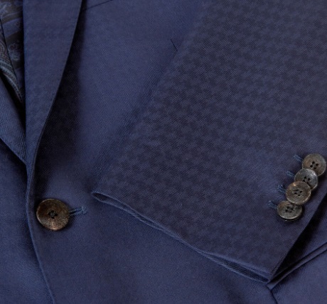
But Etro continually investigates new patterns, influences and of course colour combinations. This season (along with the ever present paisleys) consider the glossy, lush, prowling tiger and water lily prints – a nod to painter Rousseau, perhaps, or carpet patterns on jacquard weave – present also in the company’s Home collection where you can collapse into capacious, printed cushions and be camouflaged wearing the same printed suit!
But whilst tradition may be important, Etro is also continuing with its commitment to eco-friendly fabrics for its creations and interestingly, showcases this year,unique pieces which feature patchwork denim trousers and jackets which include vintage cloths. Shirts are made from eucalyptus yarn and polo shirts made from plastic bottles in a bid to help the planet. The result? Still luxurious.
The logo of Casa Etro is as distinctive as it is subtle and even those who naturally eschew an easily recognisable label – because who wants to be an unpaid advertiser? – actually seek it out and love to wear it openly. It is an image of a leaping Pegasus silhouette, encapsulating the freedom and energy of the company. Pegasus, a creature of mythology symbolizes spiritual freedom – and the possibility of the impossible.
The winged horse may be the stuff of imagination but Etro has made its company fame – and fortune, real enough.