BOOK REVIEWS: By Robin Dutt
The idea that books (in themselves) as fat, beautiful doorstoppers is a thing of the past is quite incorrect. Yes, so a voucher is akin to a certain cheeky liberation regarding spending someone else’s money intended for you but to actually have a real tome delivered or given is a joy. Now…What do we mean by ‘tome’? Easy. Nothing paperback and anything oversized. Thames & Hudson has been in the business of celebrating art, design and aesthetics since 1949 and are past masters when it comes to an oversized book. And of course, this is no criticism. Live it large might be a general call to arms – or charms. T&H certainly does.
Shall we say, their books are ‘statement publications’? In the old days, I suppose they were called ‘coffee table books’ which carried with it the suggestion that they were part of an interior designer’s colour or fake intellectual aesthetic scheme. Somehow the suggestion also is that these books were destined never to be opened and so remained virginally mint. But it worked – and still does. I purchased my first apartment on the strength that the sellers had lavish tomes on their possibly India Jane, blond wood, trunk-cum-coffee table and coincidentally, a copy of an art magazine which I contributed to at the time. What folly. But you see the power of strategy…Perhaps as sellers, they had done some research on the potential buyer?
But here are three beauties to consider for the bookworm friends that you might have who might like the physicality of a book that weighs more than a brace of Koalas but offers better intellectual stimulation…
‘Sapphire – A Celebration of Colour’ by Joanna Hardy. (Edited by Robert Violette)
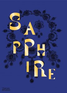 There are only four precious jewels in gemology and proudly sported by knowing (or lucky) hands, necks and lapels. Rubies, Diamonds, Emeralds – and Sapphires. Reduce any mineral to the basics and you are left with chemical numbering and the dullness of disconnected lettering. But when cut and buffed, this product of the earth attains almost celestial glamour. And it has been the same since time began. The idea of capturing shine, glitter, gloss and sparkle was not lost on the ancients, wherever they came from on this tiny globe and celebrated the rarity and beauty of rough shards and roundels from the earth which could then reflect and project elements of the day or night. It was and still is surely, magic.
In this lavish book, Hardy takes us on a gem-spangled journey which celebrates one of the most beautiful stones ever discovered. And with chapter titles such as. ‘Medicine & Magic’, ‘High Society’ and ‘Showstoppers’, the author stops at nothing when describing the lure of this gem whose colour might be the hue of a spangled night sky illuminated by the moon or those further reaches of the bluest ocean. And one will also learn that sapphires are not only blue in colour.
Famous sapphires are recorded such as Her Majesty’s Wedding Sapphires and Princess Diana’s Engagement Ring (which went on to be worn by HRH The Duchess of Cambridge). But Hollywood royalty also gets a look in, in the form of precious piece worn by the likes of screen legends such as Mary Pickford, Joan Crawford and Cher, who sports in an iconic portrait, the 733-carat Black Star of Queensland – a black star sapphire set in a diamond surround. Sophia Loren, Capucine, Ursula Andress and Elizabeth Taylor also feature as ready made ‘fleshy stages’ for the charm of this beautiful, precious stone.
But there are also other objets hewn from this precious material shown in the book such as a carving of a Hindu saint, a miniature pair of beautiful feet and this writer’s personal favourite – anything made out of a star sapphire where a distinct star shape within the gem, Arctic white – dances in the denseness of the midnight blue. The star shape seems to float and almost vibrate.
One might be reminded of Jonson’s ‘Volpone’ when thinking about gems, as he wrote the words of his protagonist regarding gold – ‘Thou that can do nothing but make men do all things’. It is the same with fine gems. Useless and utterly, utterly captivating…
‘Sapphire – A Celebration of Colour’ by Joanna Hardy is published by Thames & Hudson
‘Versace – Catwalk’ Text by Tim Blanks
 It is quite possible that Versace is one of those love it or hate it type of designers. Dare one mention Marmite in connection with this?!? The precise opposite of the minimalism of, say Giorgio Armani, he shares more with the flamboyance of his fellow creators (and rivals?) such as Roberto Cavalli and Dolce & Gabanna. Featuring over 1,200 images, this is a comprehensive look at the late master’s take on florid, fabulous fashion with no nod to restraint. One seems instantly to recall that image of two young film stars, Sophia Loren and Jayne Mansfield at a chic, glittering dinner, the former eyeing the latter, practically tumbling out of her low cut evening dress, one nipple almost eyeing the competition – but not quite. Some might say she was brash. Loren’s expression seems to say so. But this is what some may feel about Versace’s clothes, when he was at the helm of his house before he was murdered and now still under the directorship of his sister, Donatella. But in Versace’s hands, if it is brash, it is beautifully so. And one has to say, there are quiet moments too. Gianni Versace’s brilliancy was to also be sartorially chic when not pursuing chromic ‘madness’ in the form of wild prints and clashing colours, often featuring animal prints, celestial symbols and colour blocks, to say nothing of the extravagance of gold splashes and details.
There is something definitely magical about the name, Versace, itself. I recall so well that my friend at university went all the way to London to buy a pullover he had seen advertised in Vogue. It was around 1980 and it cost something just shy of £300. You do the maths! I remember his return when he unpacked the item from the glossy bag and placed it on his bed. Even seeing the bag alone was an event! I had just bought a jumper from the little market in town for £5…This treasure he had snatched from London’s South Molton Street was as a jewel and very restrained in shades of nutmeg and moss. A jumper it certainly was but when my friend tried it on, and lithe and over six foot tall as he was, it made him look even more fabulous. And remember this was really, just a piece of knitwear…
This heavyweight tome begins the Versace journey from 1978 with the Ready to Wear ‘Military Collection’ and ends with 2021’s Ready-to -Wear, ‘La Greca’. As every design house knows, titles for collections are vital. So, in between, we have such themes as, ”Underwater’, ‘In the Cut’, ‘Road-Trip’, ‘On Parade’ and ‘Perfect Imperfect’. ‘I don’t like the idea of forcing a single look on anyone’, the master once told Women’s Wear Daily, before his Spring 1989 show. ‘Fashion should be as easy as drinking a glass of water.’ And he was right – because he was not talking about Style. This is more akin to sipping delicately at an etched crystal glass of Chateau d’Yquem. Preferably Edwardian. The glass, I mean.
Here you will discover or re-discover iconic pieces such as the homage to Andy Warhol dresses, splashed with Marilyn Monroe Pop Art portraits, others plastered with Vogue front covers, fluorescent shifts, glossy satins, studs and lace, embellished denim, floaty silks and of course, lashings of deepest black on everything from a tiny cocktail dress to a billowing gown. Oh…and a sprinkling of oversized safety pins, a la Hurley.
There can be no doubt that Versace was a genius, someone of ‘exceptionally great creative power’ in this case and Tim Blanks’ text goes quite a way to describe his fiery and independent essence as a spirited and unique creator. No shrinking violet he, and as I recall with a seemingly permanent semi-snarl after I encountered him in Harrods (but presumably not because of me) he remains, although he passed on in 1997, the heart of one of the most vital and delightfully experimental Italian fashion houses. Certainly, his house is one of the most vital – and of course not to everyone’s taste. I once encountered a lady at a cocktail do who was wearing a tube dress in I believe some sort of soft but robust jersey material with the house’s name in diagonal stripes. She looked like a stick of rock. I approached with my martini and asked (in a friendly way) and with no suggestion of a whip-smile on my lips, who designed her outfit? Needless to say that was the end of that conversation.
It was largely due to Gianni that we have the term, ‘Supermodel’ featuring such stellar names as Naomi Campbell, Linda Evangelista, Cindy Crawford and Christy Turlington. As a corporate ‘one’ they set the standard that still resonates today even if the name for them collectively has waned and aged. But you can’t do this in clothes which do not positively shriek for attention. ‘Polite’ clothes, in general Mr V did not do. Of course, Thierry Mugler did it his way as also, the wonderful Jean Marc Sinan but Versace ruled the glamour roost and intended them for women who were not afraid of being noticed. They were and are also women who knew that Brash can be Beautiful.
It should be remembered that it is also Versace’s sense of tailoring which is so much to the fore. Remember the much missed Prince, dazzling in strident Versace suiting? That red suit!
And so, now, as I sit in my ebon-hued, glossed to Hell Versace leather coat from the ‘nineties and think of my only other one at the top of the house (also leather) but festooned with those sun disk Medusa buttons, from around the same decade, I am so glad that I was not tempted to save up for a sweater.
‘Versace – Catwalk – The Complete Collections’, is published by Thames & Hudson.
Vogue Paris – 100 Years. Edited by Sylvie Lecallier
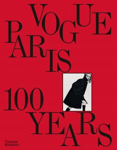 For many people, Paris Vogue was the only Vogue, writes Robin Dutt. I recall the difference of the French edition compared to all others – the chic, the style, the downright arrogance of being simply, right. This was at a time when buying a copy was akin to being quite wealthy – or thinking that you were or simply, wanting to be. And more than that…A person of discernment. Those days are gone. There used to be a ritual every month with my friends, of buying their ‘Vogue Moment’ – a cappuccino and a copy in the town square and making sure you folded the magazine in half and clutched it on your way back to your digs, branded with the title you were all to happy to be branded with. It cannot be a coincidence that several clutch bag designers, created examples which looked like folded magazines in rigid plastic – a fashion that began in the 1950s and perhaps, even earlier.
‘Vogue Paris – 100 Years’ is a wonderful book celebrating style and the photography that captured that style. And of course, it is amazing how forward-looking past fashions were. The heart of it all is surely an understanding of timeless elegance. Vogue might simply mean ‘what is now’ but it means so much more than that. To be ‘en vogue’, ‘in vogue’ au courant’ ‘ and even dans le vend’ are all markers of the life blood of fashion itself and the understanding of discernment. And of course, money well spent on frivolity. Well…One might as well spend it on something…
As a reminder of how vital architecture is to couture, there are images here, a-plenty which compare and contrast marble and fabric, sweeping stairs and monuments, street scenes and park benches. Juxtaposition, after all, can be…everything! It may be well worth remembering that so many couturiers and even fashion designers had their beginnings in the study of architecture – Dior, Balenciaga, Cardin, Alaia, to name but a few The list goes on. It was the great, late Scott Crolla who once said that a designer can design anything be it a luscious, juicy liquid gown or a set of strident, steely cutlery and all true creators (especially Monsieur Cardin) would have surely agreed. He, after all, designed everything from bubble dresses to aeroplanes! Crolla designed glittering coats and velvet chairs and so much more besides.
So many images will be all too familiar to so many. The book has amassed treasures by William Klein, Irving Penn, Arik Nepo and later stars, Mario Testino and Bruce Weber. Then there are marvellous drawings. One often forgets that photography was an invention dating from around the 1840s and that images in periodicals of all kinds were often hand drawn. Engravings and etchings featured too., to partner the words. The charm of the hand drawn was never lost on Vogue magazine. It was a connection with the artistry of clothes design and especially, couture. So prepare for blasts from beautiful pens and pencils from stars such as Pierre Brissaud and Georges Lepape, Pierre Le-Tan and Mats Gustafson. Drawings make fashion live in quite another way to the blatancy of photography. Cinematic might be what we expect but drawings are elements of the soul of the creator, in quite a different way.
Vogue Paris – 100 Years is published by Thames & Hudson


